Reducing Friction in UX: How It Impacts Crypto Deposits and Retention
Reducing friction in UX impacts deposits by making crypto funding faster, clearer, and easier to complete. This guide explores how better UX can improve deposit completion, user confidence, and long-term retention.
When operators ask whether reducing friction in UX impacts deposits in a measurable way, the answer usually starts with one moment: the first crypto deposit. If that journey feels unclear, delayed, or risky, users are more likely to stop mid-flow, create support demand, or hesitate before funding again.
That is why reducing friction in UX impacts deposits and retention most clearly at the point of transaction intent. In a crypto deposit flow, users are not browsing casually. They are trying to complete a high-intent action that depends on trust, timing, and precision.
A smoother flow does not guarantee better retention. But it can reduce avoidable confusion, improve deposit completion, and make repeat funding feel more reliable.
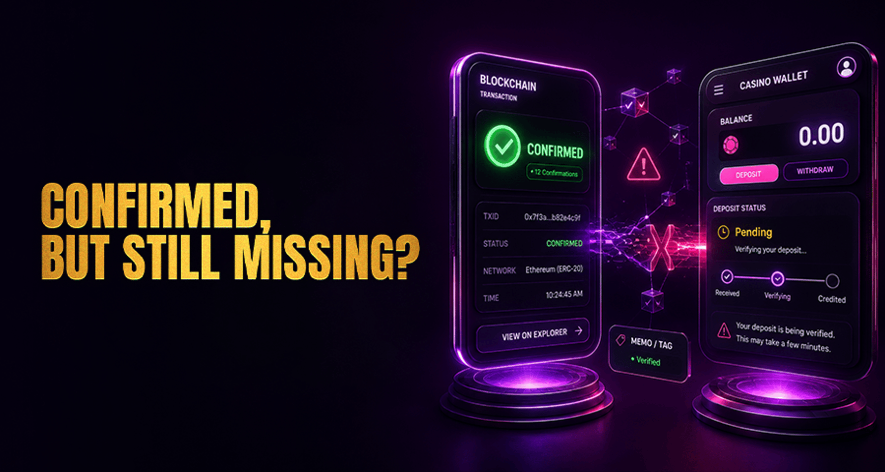
Transactional support takeaway: If deposit completion drops or “deposit missing” tickets rise, check network-selection clarity, minimum deposit visibility, pending-status messaging, and wallet handoff behavior before assuming a payment processing issue.
Where crypto deposit friction shows up first
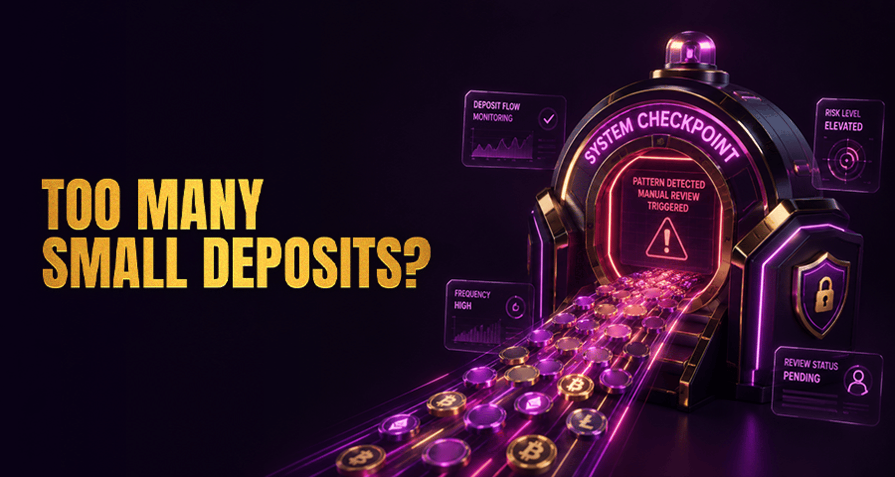
Most deposit friction appears in a few repeat places:
Users are unsure which network to choose
Minimum deposit requirements appear too late
Pending deposits have vague or incomplete status messaging
Mobile wallet handoff breaks or loses context
Users copy the address but never complete the transfer
These are not minor UX defects. In crypto deposits, each one can interrupt a high-intent funding action and create downstream retention risk.
What friction means in a crypto deposit journey
In this context, friction is any avoidable uncertainty, delay, or error risk between deposit intent and successful funding.
That can include:
Deposit entry points that are hard to find
Poor network labeling before the address is shown
Minimum deposit details hidden until late in the flow
Weak confirmation after copying the address
No meaningful explanation of pending status
No clear help path when the user gets stuck
The goal is not just speed. The goal is to make the next correct step obvious enough that users can complete a crypto deposit without second-guessing basic parts of the process.
Why reducing friction in UX impacts deposits and retention
The connection between UX and retention is usually indirect but important.
When the first deposit feels stable and understandable, users are less likely to associate funding with confusion. When the experience feels fragile, trust drops quickly.
That is why reducing friction in UX often affects deposits and retention through a few practical mechanisms:
Clearer funding steps can help more users complete deposits
Better status communication can reduce false alarm support tickets
Lower uncertainty can improve trust during the first serious account action
A predictable first deposit can make later deposits feel less risky
This should be framed carefully. Good UX can support completion and repeat use, but it does not guarantee conversion outcomes. The more accurate point is that poor deposit UX creates hesitation at exactly the moment operators can least afford it.
The highest-impact friction points in crypto deposits
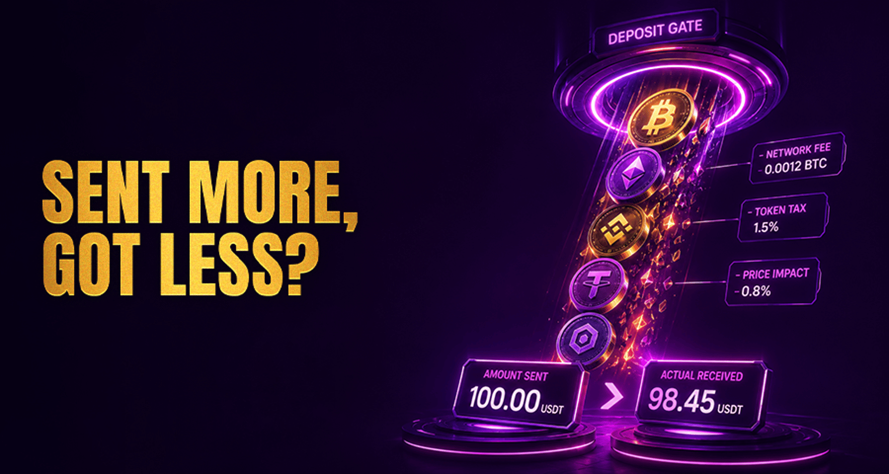
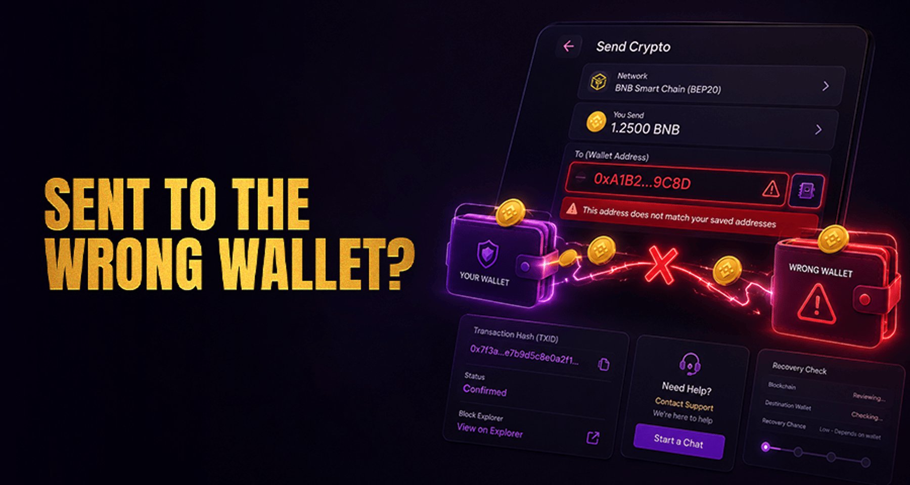
1. Network clarity before the user copies the address
Wrong-network transfers are one of the most expensive forms of deposit friction because the mistake often happens before the user realizes there is a risk.
Strong deposit UX should:
Keep the selected network visible next to the address at all times
Show a short warning before copy, not only after
Make chain labels visually distinct
Use plain-language comparisons when users may confuse formats such as TRC20 and ERC20 differences
If users need to stop and decode the network label, the flow is already carrying too much friction.
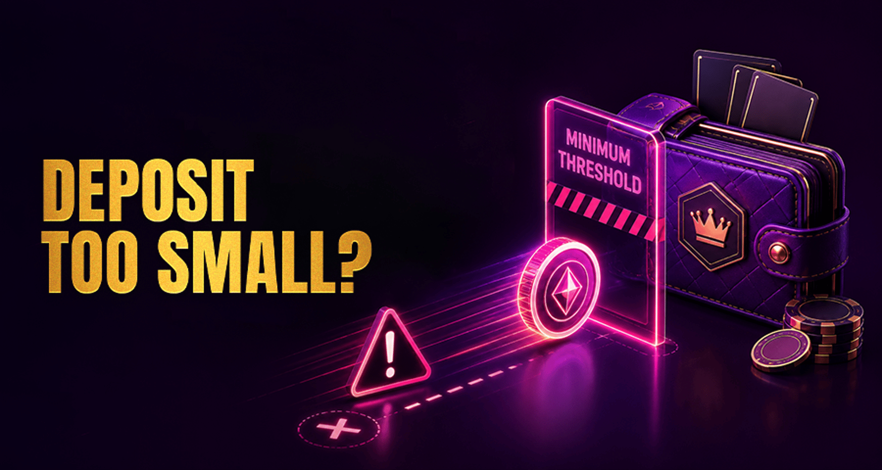
2. Minimum deposit requirements shown before commitment
Minimum deposit details should be visible before the user copies the address, scans the QR code, or leaves for a wallet app.
Good implementation usually means:
Showing the threshold near asset and network selection
Repeating it near the address or QR area when helpful
Using clear units and simple wording
Linking to a direct explainer on minimum deposit requirements only when the user genuinely needs more detail
If users learn about the minimum only after sending funds, the UX created the problem.
3. Pending-state messaging after funds are sent
After the transfer is sent, the main UX challenge is no longer action clarity. It is reassurance.
Users want to know:
Was the deposit detected?
Is it still waiting for confirmations?
Is this normal?
Should they wait or contact support?
Helpful status design includes:
Clear confirmation that the address was copied or scanned
Plain-language pending messaging
Expected timing framed around confirmations
A visible status area in the account
Clear guidance for what to do if the wait exceeds the normal range
This is also where support teams often misread the issue. Many “missing deposit” reports are not true payment failures. They are communication failures. The transaction may be progressing normally while the interface gives the user no confidence that anything is happening.
When timing confusion is the real issue, a targeted explainer on how long crypto deposits usually take fits naturally here because it answers the immediate user question instead of acting as a generic support link.
4. Mobile wallet handoff and return flow
Mobile deposit journeys are especially sensitive because users often move between browser, app, wallet, and account status screens.
Common friction points include:
Deeplinks that fail without a fallback
Small tap targets around copy, scan, or open-wallet actions
Instructions pushed below the fold
Lost state after returning from the wallet
No clear restart path if the handoff breaks
This is less about visual polish and more about continuity. Small breaks at this step can be enough to stop a deposit completely.
Operator evidence signals to check first
To improve information gain beyond generic UX advice, support and product teams should look for specific evidence patterns.
Support-tag patterns
Watch for repeated tags or ticket phrases such as:
“wrong network”
“deposit missing”
“below minimum”
“pending too long”
“wallet did not open”
These tags often reveal the exact friction point faster than broad funnel summaries.
Event gaps in the deposit journey
Compare the sequence between:
Deposit page view
Network selection
Address copy or QR interaction
Return visit from wallet
Deposit detection or pending state
Successful credit
If address-copy events are high but completed deposits lag, check threshold visibility, network confidence, and wallet handoff first.
User-behavior markers
Look for patterns such as:
Repeated deposit-page visits in one session
Multiple copy actions without a completed transfer
Fast exits after network selection
Repeated status refreshes after a transaction is sent
Duplicate support contact before the normal confirmation window ends
These markers are more useful than generic page-drop metrics because they map to real crypto deposit uncertainty.
How to prioritize fixes without drifting off-topic
Teams often lose focus by treating deposit friction as a broad payments or support problem. The sharper approach is to stay centered on crypto deposit completion and retention signals.
A practical order is:
1. Fix irreversible-error risk
Start with anything that can cause a hard-to-recover mistake, especially network confusion.
2. Fix hidden requirement friction
Next, make sure minimum deposit rules and key conditions are visible before the user commits to the transfer.
3. Fix reassurance gaps
Then improve pending-state communication so users do not interpret normal confirmation delays as failures.
4. Fix mobile continuity breaks
After safety and clarity are covered, improve wallet handoff, return-state persistence, and fallback paths.
This keeps the work tied to actual deposit friction rather than drifting into broad payment-method discussions that do not solve the immediate problem.
What operator and support teams should check when deposits drop
If deposit completion falls or deposit-missing tickets rise, check these first:
Whether users can clearly confirm the correct network before copying the address
Whether the minimum deposit is visible before wallet handoff
Whether pending deposits are explained clearly during normal confirmation windows
Whether mobile wallet open and return flows preserve user context
Whether support-tag patterns match a UX communication issue rather than a payment processing failure
This is the fastest first-pass framework for transactional support teams. It reduces the chance of escalating the wrong problem.
Practical checklist for a crypto deposit UX review
Use this checklist when reviewing a live deposit flow:
Is the deposit path easy to find on desktop and mobile?
Can users verify asset and network before copying the address?
Is the minimum deposit visible before any wallet action?
Does the UI confirm copy success clearly?
Is the pending state explained in plain language?
Can users see what normal confirmation delay looks like?
Is there a clear next step if the deposit takes longer than expected?
Is support access available inside the deposit journey?
Does the mobile wallet handoff include a fallback path?
Do support tags and product events point to the same friction source?
What to measure before calling it an improvement
To judge whether reducing friction in UX impacts deposits in a meaningful way, measure more than top-line conversion.
Useful signals include:
Deposit-page drop-off rate
Address-copy actions versus completed deposits
Time from deposit entry to successful funding
Repeat deposit-page visits without completion
Support contacts related to network, threshold, or pending confusion
Mobile wallet handoff failure rate
First successful deposits followed by later deposit activity
It also helps to group issues into three buckets:
Error-risk friction
Clarity friction
Continuity friction
That makes it easier to identify whether the real issue is dangerous confusion, hidden requirements, or weak status communication.
Conclusion
Reducing friction in UX impacts crypto deposits by making funding steps clearer, safer, and easier to complete at the exact moment users are trying to act. In practice, the biggest gains usually come from better network guidance, earlier visibility for minimum deposit rules, stronger pending-state messaging, and more reliable wallet handoff.
The retention impact is not automatic, but it is real. A smoother first crypto deposit can reduce avoidable stress, lower preventable support demand, and create a more trustworthy path back to future funding.
For operators, the priority is simple: identify where users lose confidence during the deposit journey, then fix those moments before treating the problem as a broader payments issue.